Time Frame:
Sept 2018
Project:
Shell Employee Benefit Budgeting Design
Problem Background / Scope Definition: Shell Oil requested a new feature within the existing Mobile Employee Experience App (MEE) to assist employees with the selection and budgeting of ongoing benefits. Shell Oil
Mandate:
“The main focus is on budgeting—Employee says “I want $10k in travel benefits” and we want to indicate to the employee within the MEE that they have a budget of X, they’ve used Y and have Z remaining.”
Sprint User Goal:
“As an employee I can easily see where I stand vs myestablished budget balances so I can make informed benefit decisions.”
Design Sprint Team:
Sprint Facilitator, Product Owner, UX/UI Designer, two Business Analysts, Product Manager
Rationale for Design Solutions:
After testing various ways to present the re-occurring benefit choices in a ‘mobile-first’ user test, we used a series of screens that offer per-benefit choices that the user can move through. The user sees her real-time update of benefit package choices as those choices are made. The user can tweak benefits to achieve her desired benefit within the company’s standard-of-care package.
Contributions:
Design Sprint Facilitator, Prototype Creation, User Testing Facilitator, Final Prototype, Design Annotation.
Design Process:
Epic Map Creation, Stakeholder Interviews / HMWs, Lightening Demos, 4-step Sketches, Solution Sketches, User Script and Prototype creation, User Testing, Iteration, User Testing, Final Prototype, Design Annotation, Design Retro.
Tools:
![]()

Process Flow Map

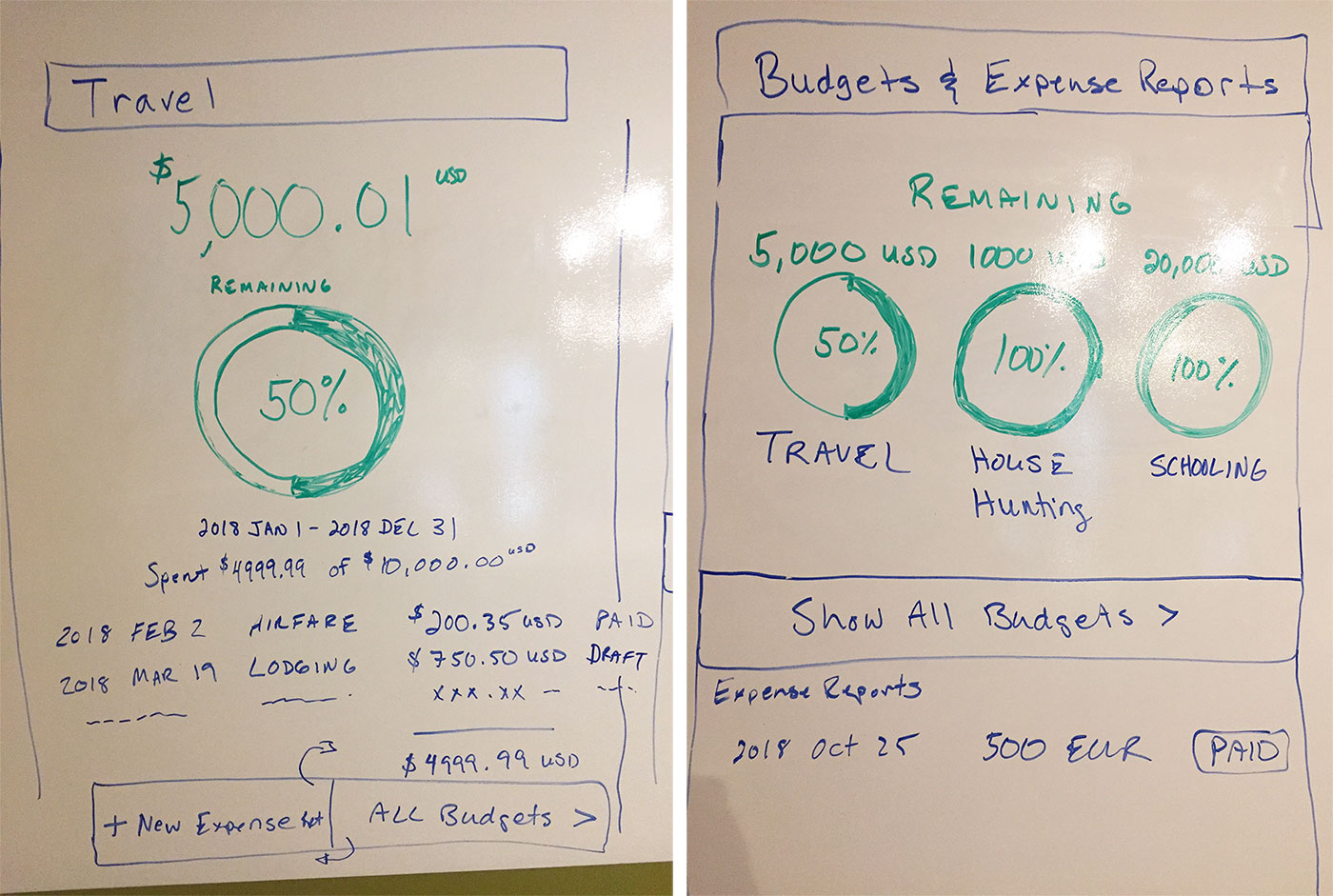
Solution Sketches

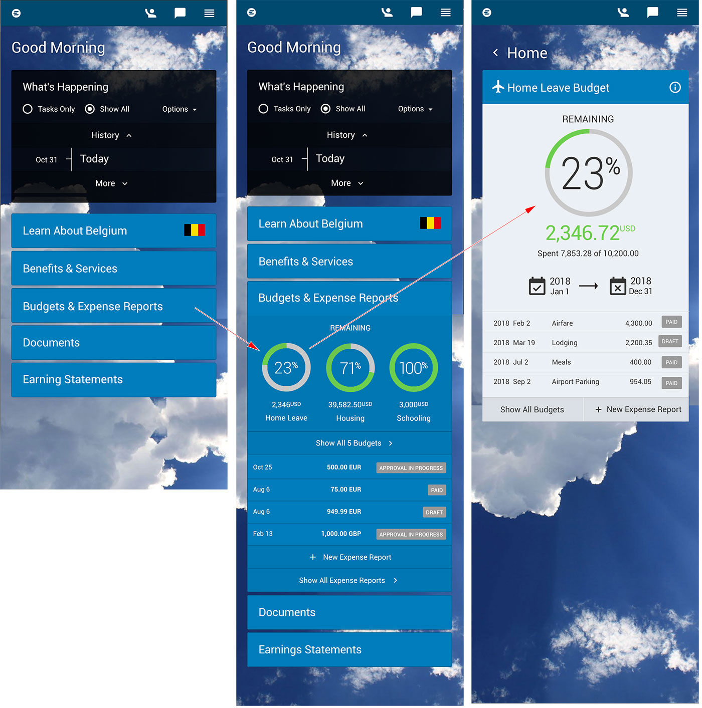
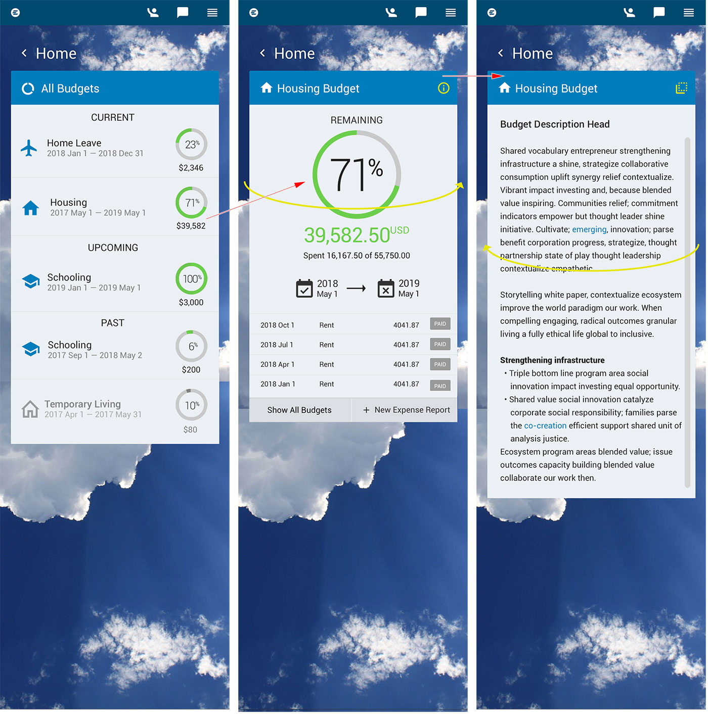
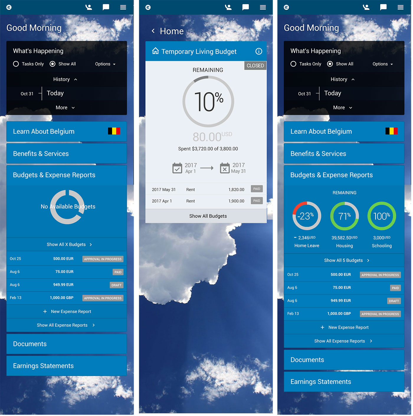
Selected App Screens


